Selecting the correct words for your prompt to get the image you want out of an AI is an art in of itself. In the process of producing the images to accompany my free and original short stories for kids, I did a significant amount of experimentation with different prompts.
For this guide, I organized my definitions and findings so that they can also be helpful to the greater community of AI content makers. I made all of the images on RunPod using the Stable Diffusion Automatic1111 v1.5 model. You can also check out my review of RunPod vs other web services.
Vibrant Color Palette AI Prompts
There is a vast array of words I can use to describe different color palettes, effects and tonalities. To prevent this guide on AI prompts from becoming an unwieldy behemoth, in this first section I am going to focus on the following vibrant color palettes:
- Vivid: strikingly bright or intense
- Electric: causing great emotional or mental stimulation
- Neon: extremely bright and flourescent
- Psychedelic: suggestive of effects produced by drugs
- Rainbow: multicolored array
- Colorful: having many or striking colors
- Polychromatic: exhibiting a variety of colors
In a future supplement to this guide, I will experiment on muted color palettes.
Adjustment Property Definitions
There are many words used to describe color properties in art and photography. For this guide, I examine 5 of the most important ones. Anyone with a passing familiarity with image editing is probably familiar with these terms.
Within each category, I set up a binary of words I frequently see used in AI prompts posted on Reddit, Lexica and other prompt aggregator websites.
- Hue: Tint or gradation of color. Sometimes use synonymously with shade and overtone. In the Munsell Color System, the 5 hues are red, yellow, green, blue and purple.
- Saturation: How much of a color is present. I sometimes see chroma used interchangeably with saturation, but it is technically a scale used by the Munsell Color System to compare the brilliance of different colors. For the purposes of this guide, I am assessing the effect of “saturated and “unsaturated” on image results.
- Luminance: The amount of light emitted over the area of a surface. Sometimes used synonomously with lightness or brilliance. For this guide, I will study the effects of the qualifiers, “bright lighting” and “dark lighting” for this property.
- Tone: The effect in painting of light and shade together with color. Tone can also be used to describe emotional components of a work, but for the purposes of this guide, which focuses on color, I am going to use the words “warm” and “cool”.
- Contrast: Dissimilarity between elements in an images; can apply to color, light and texture. For this guide, I will use the AI prompts “high contrast” and “low contrast”.
Setting up the Style Prompt
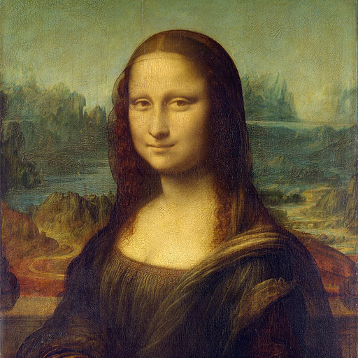
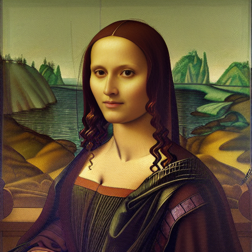
To ensure our experiment only used color and adjustment prompts as our variables, I did some work up front finding a style prompt and Stable Diffusion settings that would consistently give me output images with a color palette similar to Leonardo da Vinci‘s painting, Mona Lisa.


Style prompt: Three quarter profile portrait of a woman sitting, long brown hair, brown eyes, smiling, wearing a dress and shawl, landscape background. Sfumato, soft, intricate, detailed, 15th century masterpiece, Italian renaissance, oil painting in the style of Leonardo da Vinci
Negative prompt: Ugly, amateur
Settings:
- Sampling steps: 60
- Model: Euler A
- CFG: 12
- Denoising strength: 0.6
- Seed: -1
It’s worth noting that the color palette of Da Vinci’s attributed works is consistently earthy and brown, due to so much of his paintings fading over time, the varnish getting dirty, etc. Also, many of his works were never completed, so they exist as preparatory sketches on yellow-toned parchment and plaster. Because of this, a secondary experiment is to see how much our color and adjustment prompts are able to override the palette of the images most likely used to train Stable Diffusion.
To test the effect of each word, I added it to the prompt and surrounded it with triple parentheses to really emphasize it, like so:
(((very saturated color)))(((vivid colors)))
Results
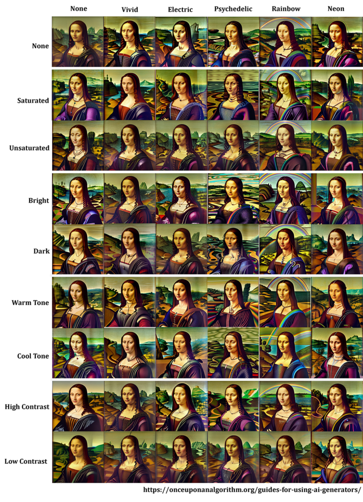
After generating hundreds of images, I compiled the best ones into the following table:

From this table, we can draw some of the following conclusions:
- Stable Diffusion gets very confused by prompts that can be used synonymously with a color palette as well as a physical element. For example, it added both neon colors and neon piping to the image. Psychedelic was incorporated through both pattern and color, but mostly pattern. And rainbows. Rainbows everywhere.
- The “vivid” and “electric” prompts consistently, but subtly, produced palettes that popped more than the original image. Vivid was a mixed bag, which makes sense given how broad the term is. Electric usually, but not always, added fluorescent light blue somewhere in the image.
- SD appears to understand the concept of color saturation, but it can be subtle. The rows for saturated and unsaturated do indeed look like their respective prompts. The one exception was in combination with rainbows. I guess unsaturated rainbows is just not a thing in SD’s world.
- SD seems to understand different levels of luminance, but it implements it unpredictably. Sometimes it would pick darker colors such as black over red and sometimes it deepened the shadows or thickened outlines. If you want your image to be dark or light in terms of greyscale, you’re more likely to get your desired effect through different lighting-specific prompts or by color grading in an image editor as part of your post-process. It’s also possible the words “dark” and “light” are too generic to work as prompts.
- SD interprets “warm tone” as red/orange/yellow and “cool tone” as blue/green/purple, which is what I would expect. However, that tends to apply only to objects. When it came to Mona Lisa’s skin tone, SD was all over the place. If you truly care about having consistent color tones in their AI generated images, my recommendation is to color grade it with an image editing tool such as GIMP or Photoshop.
- Stable Diffusion implements the prompt “high contrast” by boldening the outlines between elements and choosing contrasting adjacent colors. You can see bias towards bold outlines in the folds of Mona Lisa’s dress, and the contrasting colors in the landscape behind her.
Related Articles
Our review on using RunPod IO vs AWS to run Stable Diffusion.
How to use in-painting in Stable Diffusion to make detailed images for One Drop in the Ocean.
How to use img2img in Stable Diffusion to make the header image for Little Frog, Big Dragon.
